I'm working on a game using Irrlicht, we planned to use a 3D Studio (6) model to use as a landscape.
The game is a risk-like strategy board game.
But when we load the model, it's very ugly.
How can we improve this (is it because of the level of detail?)
Here are 2 screenshots:
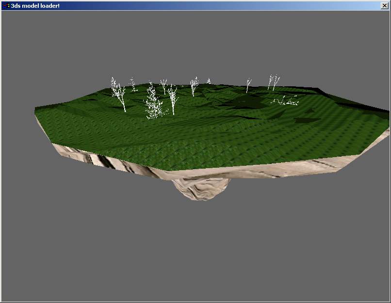
Screenshot using irrlicht
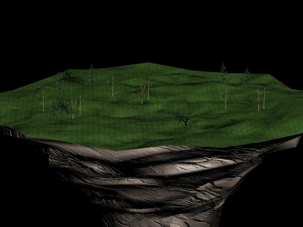
Rendered in 3D Studio MAX.
All suggestions are welcome!
Ugly model importing 3D Studio
You can't get the same visual efect in Irrlicht (as well as in most of 3D engines) as in Max (as well as in most of modeling progs.) since it use diferent rendering methods. Firsth goes for speed second for quality.
If you would like to get it close to hove it looks in Max you would need to use shaders and multiple texture materials ...which take some additional codding.
There are some predefined efects you can use ..look at SpecialFX tutorial.
Also ...your model looks to lack smoothing in Irrlicht ...I heard that it happen when you load 3ds format. I am not sure since I work mostly with x.
Another problem is your grass texture which looks tilled. Try to scale your texture or use diferent one, on which you cant see repeated tilles so much.