I've recently been working on a 2D animator, and have made some drastic changes to the GUI. I'll show you the before and after, and would love to have some criticism on what can be changed to make it even better, and I'd love to hear what I've actually done right .
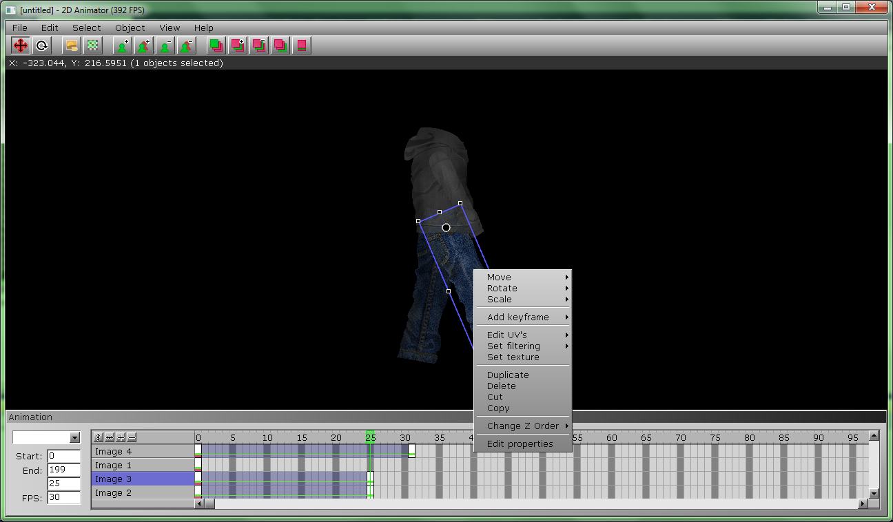
Here's the interface before:
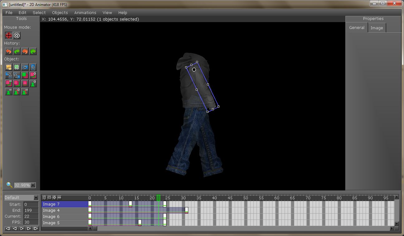
And here it is after:
I know the properties window is completely blank, but I'm getting to that . So please, if you notice anything I could change to make it better or can tell me what you like or don't like about it, I'd greatly appreciate it.
The only differences are that the new version has darker skin color and more compact buttons. The new one looks better. As a whole not bad at all, but if I was you, I`d try to use less colourful button images. Maybe go for a light greenish cyan, light blue-purple or even light orange if you like gamma, but definitely not that colourful, as they are distracting the viewer from the most important thing on the screen- the scene. As a whole the button images are good, except for the coulour scheme as I said and the outlines of the "History" arrows on the right. Same for the magnifying glass- yellow is definitely not the right outline color. Maybe use just black. You can remove the background of the line showing X and Y, or at least make it transparent. But I`d remove its background. Try putting it at the bottom to see if it fits better. The last thing is that the backgrounds of the properties and tools windows have some weird diagonal line and somewhat messed up color. Also I wouldn`t use red color for the movement icon, I`d make it the same as the rotate icon. As a whole, try not to use full red for the icons, unless you really need to.
But definitely very nice overall.
"Although we walk on the ground and step in the mud... our dreams and endeavors reach the immense skies..."
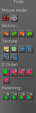
The move button is red to show that it is the current mode selected, and the background for the status text is to make sure it can be seen when over a white image (The background is transparent, it's probably just hard to tell over the black background). And I definitely agree with the button colors. I'll try setting up a definite color scheme that the buttons can use to make it more uniform and less distracting. I'll have to see what's causing the weird lines, as it's pretty much vanilla irrlicht. As for the button grouping, I've been trying to find a way to group them that doesn't look really clunky. Here was my previous attempt, and I don't think it looks really pleasing:
What can be done about the organization to make it look a bit better?
It depends. If you plan on putting more buttons or stuff in the window, you`ll need to remove them. Otherwise I think there`s no problem in labeling the groups (the "Mouse mode", "History" and "Object" labels). But whatever you do you`ll eventually rearrange and rework everything one way or another as you go, so it`s definitely not the most important thing right now.
"Although we walk on the ground and step in the mud... our dreams and endeavors reach the immense skies..."
Putting a text label for the tool category is an excellent idea in my opinion. If you have the tooltips on the icon, then it think it should be intuitive.
So this one for me is the best:
The only thing I could say, is to move the category text closer to the proper button group, as for example the "parenting" text seem closer to the button group up then the button group below.