DustbinGames Shaders

Announce new projects or updates of Irrlicht Engine related tools, games, and applications.
Also check the Wiki
Post Reply
Brainsaw
Posts: 1183
Joined: Wed Jan 07, 2004 12:57 pm
Location: Bavaria

DustbinGames Shaders

Post by Brainsaw »

Hello fellow Irrlicht developers. I have not posted on this forum for quite some time but now I'm back with a sub-project I have started recently. I wasn't quite happy with the in-game look of my game MarbleGP which I have dedicated a lot of my free time over the past years to so I created shaders of my own. The Windows version is working, my next step will be to get the Android version ready.

The project is available on sourceforge: https://sourceforge.net/projects/dustbinshader/ under the terms of the zlib license.

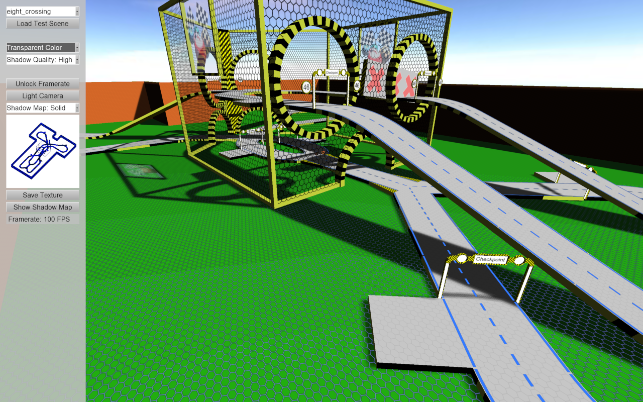
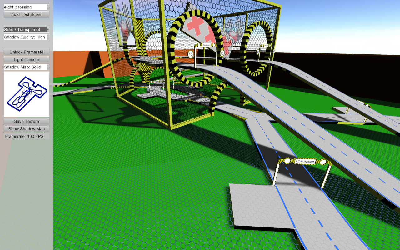
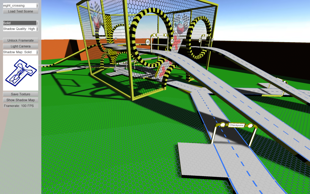
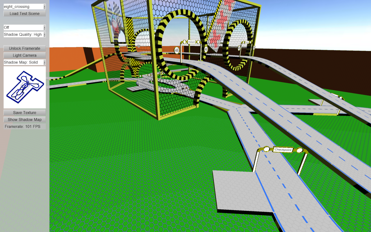
The shaders uses up to three shadow maps: number one is for the solid shadow areas, the second texture holds information about transparent areas and finally number three stores data about the colors of the shadows for the transparent parts. It also stacks up to three textures underneath the shadow: a background texture using the texture coordinates, a hexagonal pattern distributed evenly using the world coordinates of the vertices and a marking on top. As you can see in the screenshots the road marking are also glowing in the shadow with the aim to create some "cyber" style.

Here are some screenshots:

First the best settings: it renders solid and colored transparent shadows. It uses three shadow maps, one for the solid shadows, one for the transparent ones and the third one holds the color information for the shadows. I have added a transparent window to this racetrack for testing:
Image

The second screenshot shows the transparent shadows being rendered with a default opacity of 0.5, therefore it is not using the 3rd shadow map:
Image

Screenshot number three shows the solid shadows only so only the first shadow map is used:
Image

Number four it rendered without shadows. You may notice that the hexagonal pattern is distributed evenly over the surface area which was one goal for this shader
Image

Here is another screenshot from a different perspective where you have a better view of the hexagonal pattern and the glowing markings on the road:
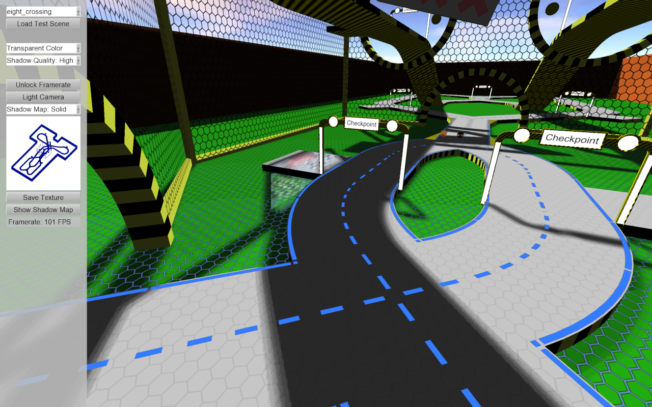
Image

For comparism I also want to show two screenshots of the current implementation. I have been using XEffects for these (which I still am a huge fan of), but I wasn't quite happy with the overall look (I think this is mainly because of my poor modeling knowledge, or because I didn't want to dive deeply into how these shaders work):
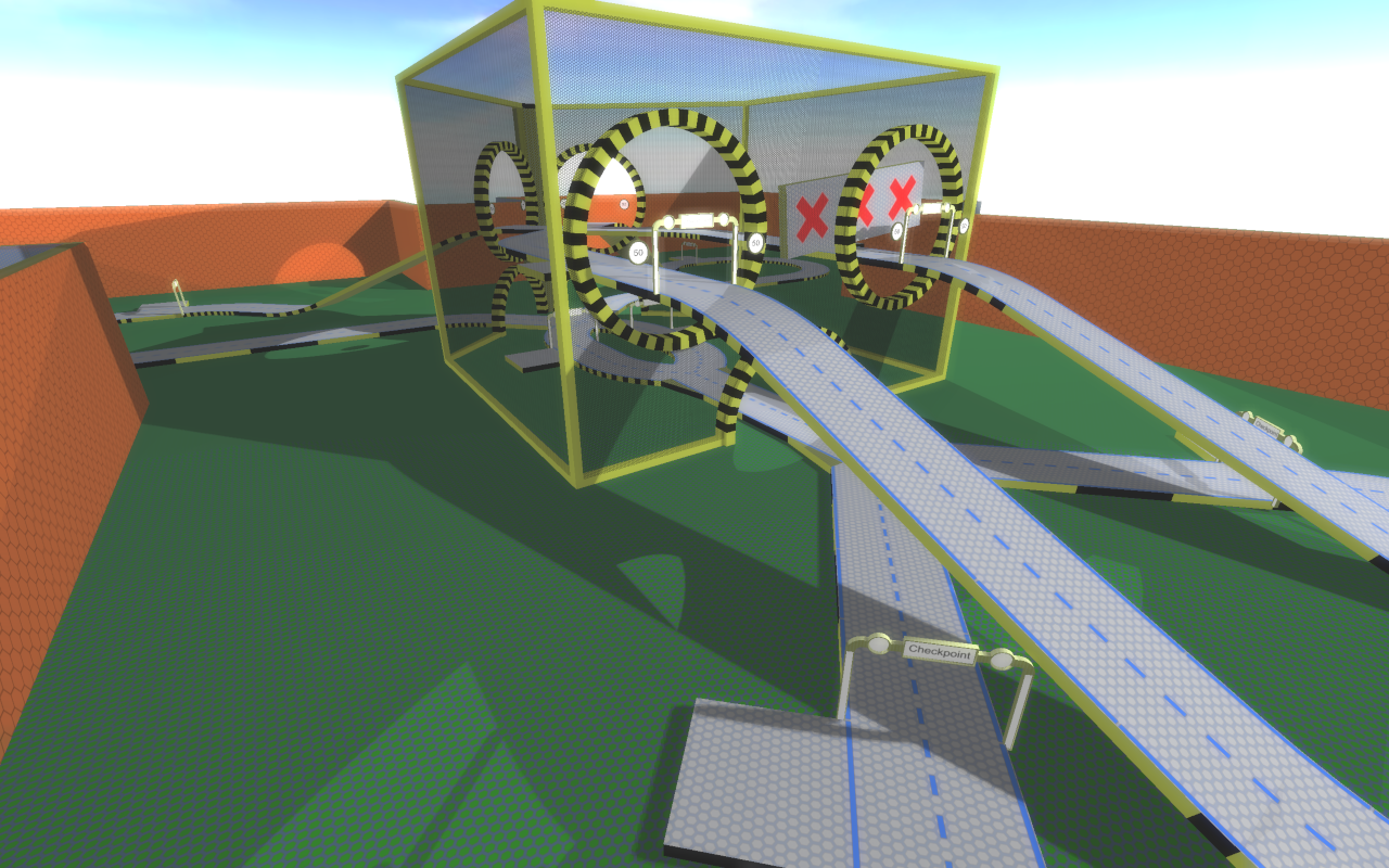
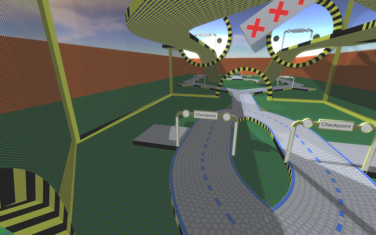
Image

Image

I hope you like what I created and would be happy for any comments.
Dustbin::Games on the web: https://www.dustbin-online.de/

Dustbin::Games on facebook: https://www.facebook.com/dustbingames/
Dustbin::Games on twitter: https://twitter.com/dustbingames
CuteAlien
Admin
Posts: 9734
Joined: Mon Mar 06, 2006 2:25 pm
Location: Tübingen, Germany
Contact:

Re: DustbinGames Shaders

Post by CuteAlien »

Your shadow-maps look good. You may consider adding a bit of an ambient term so walls are not completely black. Unless that's what you are going for. Or maybe you want to do som environment light later.

Sorry, I'm too tired to dig into the code currently, maybe after x-mas ;-)

Unrelated to shaders - going for an orange-green color scheme always risky. Especially with every color having high saturation. Your side-walls are stealing a bit the show. A nice trick for coders doing art is to look up some nice color palette online which you like and stick to that. And then put the high-saturation stuff on the elements you want to pop out (check HSV colors in Gimp or PS). Some vintage comic color palette might work for example, you seem to go a bit in that direction.
IRC: #irrlicht on irc.libera.chat
Code snippet repository: https://github.com/mzeilfelder/irr-playground-micha
Free racer made with Irrlicht: http://www.irrgheist.com/hcraftsource.htm
Brainsaw
Posts: 1183
Joined: Wed Jan 07, 2004 12:57 pm
Location: Bavaria

Re: DustbinGames Shaders

Post by Brainsaw »

Thanks for the hint, I was so concentrated on the rest of the shadows that I didn't notice that. I think I already fixed it.

At the moment I am happy with the colors, especially as I had grey walls before. I may in the future have a look into some color schemes and update it.
Dustbin::Games on the web: https://www.dustbin-online.de/

Dustbin::Games on facebook: https://www.facebook.com/dustbingames/
Dustbin::Games on twitter: https://twitter.com/dustbingames
CuteAlien
Admin
Posts: 9734
Joined: Mon Mar 06, 2006 2:25 pm
Location: Tübingen, Germany
Contact:

Re: DustbinGames Shaders

Post by CuteAlien »

Yeah, colored walls is fine. Kinda why I recommended looking into vintage comic palette - you are already pretty close to that. Browse a bit around duckipedia.de and you'll see tons of orange walls. But use a color picker and look at the saturation values - or combination of saturation and brightness (for dark colors they may use a bit more saturation). That is were you are a very extreme, you do saturate everything with very high saturation values. Even in Mario Kart you will rarely finding anything going beyond 70 saturation (in the 0-100 range).

Alternatively you could try giving your walls a dark plinth (that thingy around the bottom of walls you probably have in your home). That would break green-orange colliding directly.

Sorry, I'm not an expert with this, there's tons of tutorials out there which can explain this all better. But as a basic rule - make your background pop out less than other items in your game. And it's not the color doing that - orange is totally fine - it's mostly saturation and brightness you use in them. That's why all the paint tools have HSV sliders additional to the RGB stuff.
IRC: #irrlicht on irc.libera.chat
Code snippet repository: https://github.com/mzeilfelder/irr-playground-micha
Free racer made with Irrlicht: http://www.irrgheist.com/hcraftsource.htm
Brainsaw
Posts: 1183
Joined: Wed Jan 07, 2004 12:57 pm
Location: Bavaria

Re: DustbinGames Shaders

Post by Brainsaw »

Before taking a look into changing the color-scheme I wanted to get my shader run in MarbleGP. Yesterday I finished a first implementation and today I have uploaded a video to youtube: https://www.youtube.com/watch?v=3QAg9pDQgw4. I hope you like it.
Dustbin::Games on the web: https://www.dustbin-online.de/

Dustbin::Games on facebook: https://www.facebook.com/dustbingames/
Dustbin::Games on twitter: https://twitter.com/dustbingames
CuteAlien
Admin
Posts: 9734
Joined: Mon Mar 06, 2006 2:25 pm
Location: Tübingen, Germany
Contact:

Re: DustbinGames Shaders

Post by CuteAlien »

Shaders seem to work great. I like the colored shadows for the transparent stuff, good for the mood in the scene.
IRC: #irrlicht on irc.libera.chat
Code snippet repository: https://github.com/mzeilfelder/irr-playground-micha
Free racer made with Irrlicht: http://www.irrgheist.com/hcraftsource.htm
Brainsaw
Posts: 1183
Joined: Wed Jan 07, 2004 12:57 pm
Location: Bavaria

Re: DustbinGames Shaders

Post by Brainsaw »

That's true, the transparent shadows are great. I need to test the current version on my notebook (which is non-gaming) with Intel graphics to see if I get some decent performance there as well.
Dustbin::Games on the web: https://www.dustbin-online.de/

Dustbin::Games on facebook: https://www.facebook.com/dustbingames/
Dustbin::Games on twitter: https://twitter.com/dustbingames
Post Reply