3D character MODELLING - First King Project

Post your questions, suggestions and experiences regarding to Image manipulation, 3d modeling and level editing for the Irrlicht engine here.
lostanimator
Posts: 69
Joined: Thu Dec 06, 2007 8:06 pm
Location: SPAIN

shorter neck

Post by lostanimator »

and 105% bigger head.

How does it look? I followed the 8 head pattern, but assuming a little reduction, and long legs, as I liked your proposal for heroical figures.

Image
rogerborg
Admin
Posts: 3590
Joined: Mon Oct 09, 2006 9:36 am
Location: Scotland - gonnae no slag aff mah Engleesh
Contact:

Post by rogerborg »

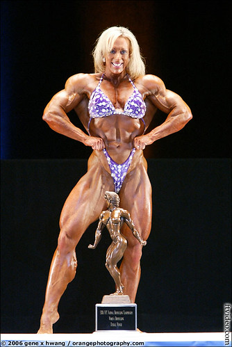
Looks like a dude with implants. Peddle us some fantasy.
Please upload candidate patches to the tracker.
Need help now? IRC to #irrlicht on irc.freenode.net
How To Ask Questions The Smart Way
christianclavet
Posts: 1638
Joined: Mon Apr 30, 2007 3:24 am
Location: Montreal, CANADA
Contact:

Post by christianclavet »

Hi David!

I'm not that qualified to find problems details in anatomy but here are my impression.

She look nice, but for a women she look kinda strong, I don't feel the "feminity" in the drawing but force. The back muscle seem big for a "standard" women and the shoulders look also very strong for a women? Something look strange in the abdominal section below the chest line (perhaps too much muscle?)

For a test, could you reduce a little the back muscle, so the line get below the breasts and reduce a little the wideness of the shoulders? (a quick sketch line over just to see, if it would look more feminine)

For me the legs look right, they seem proportionnal for a women.

Is that an attempt at doing Xena the princess warrior? :lol:
vermeer
Posts: 2017
Joined: Wed Jan 21, 2004 3:22 pm
Contact:

Post by vermeer »

much better, david

hey, if she's a warrior, it's ok if she's so.

it could be worse...

Image

btw, xena may be strong, but at same time...really hot. :D
Finally making games again!
http://www.konekogames.com
vermeer
Posts: 2017
Joined: Wed Jan 21, 2004 3:22 pm
Contact:

Post by vermeer »

Something look strange in the abdominal section below the chest line (perhaps too much muscle?
you probably noticing the line of lineart, black, in middle of abdominals, should fly away right now, and there, only set a very subtle, featheared, almost not noticeable, sightly brown darker shade, subtle... just telling a bit visually there could be a dpression there.

If wished, more female like, that is, less strong, yep, every thing less muscle shaped, smoothed, anatomy gets as "sugested" volumes only. Smaller shoulders, thin at height of middle abdominals, moreplain in shoulder muscles, difuse totally the start of biceps and end of shoulders muscle.

he started surely from man figure in this case, and might be influenced by that.

I'd do easily a paint over, but: -David would kill me. - no time, as usual... which starts to be terrible...
Finally making games again!
http://www.konekogames.com
vermeer
Posts: 2017
Joined: Wed Jan 21, 2004 3:22 pm
Contact:

Post by vermeer »

also, get rid of shades in the cheeks. Makes her look like having a prob of anorexia, or just be an over trained olimpic sports woman. get rid of em, make her pretty, and you'll have the dudes here happy... XD

But is not really neeed. Is a proportions skecth for base for comunity be able to model a female... Ppl already, with sketch as is, would avoid huge probs am seing on coder-artists trying to do human models...
Finally making games again!
http://www.konekogames.com
lostanimator
Posts: 69
Joined: Thu Dec 06, 2007 8:06 pm
Location: SPAIN

Hi you all

Post by lostanimator »

Thanks for the observations, I think you're right in all of them.

She was meant to bea a fighter type, so big shoulders where not accidental, although I already reduced them twice, I will redefine them a little more, the idea is to get somthing of the sort of sin city girls, for a general use sketch for games (which usually are meant to kick ass...).

Despite the athletic shapes (I wouldn't mind doing versions later, more skinny, more curvy, but give me time), I will surely redraw the colour work, and smooth shadows and remove the first lines that remained.

Anyway, more sexy looks are a good proposal, but she will be a tough adversary from the first sight, as clothes, softer gestures and shading will definetely make a more femenine result.

Xena is sexy, in my opinion. No doubt she's not an angel kind of girl... but well, many people find her charms, I think...

More later this week...

Keep it up.
Last edited by lostanimator on Thu Aug 21, 2008 6:45 pm, edited 1 time in total.
lostclimategames
Posts: 331
Joined: Sat Sep 02, 2006 4:11 am
Location: Michigan
Contact:

Post by lostclimategames »

if you dont mind i made a few modifications to make it more like just a strong woman, also personally I'd make the hips smaller, but thats just my preference, and that can be modified per personality on each model.

here:
Image

Edit: hair version removed.
Last edited by lostclimategames on Tue Jul 29, 2008 9:18 am, edited 1 time in total.
___________________________
For all of your 3D/2D resource needs:
Image
lostanimator
Posts: 69
Joined: Thu Dec 06, 2007 8:06 pm
Location: SPAIN

comments

Post by lostanimator »

well, I truly have nothing against this corrections, and I reckon it's a topic that mediterraneans prefer wider hips, rather than "samantha fox" (anyone remembers?).

No problem with those drawings, but as I sayd, I'll post an editable version after it's passed "the expert's test" (vermeer's comments help me locate structural or style mistakes or misobservations, working as an extra pair of eyes, with the background of anatomy and drawing techniques. Which as you can imagine, helps a lot.

I wouldn't like to confuse younger forum members or the irrlicht responsibles about the nature of this thread and it's concerns.

Adding big boobs or curly hair at this stage, is irrelevant for the aim of this drawings, and I'd prefer you to either wait for the "final" version to do this kind of "add ons", and please, to refer also that it is a mod, as I wouldn't like people to be doing bizarre versions with my name on them (at least in this thread). Be patient, propose, and send graphical indications on the drawing if you can, but if you see it as "the type of girl you like", we won't end with it, as somebody else will add different hair, thicker legs, or whatever.

But why don't you practice yourself from scratch? if you try to get a proportioned figure to be used as a reference, we can also comment on it, and maybe you take it to the stage of being a useful tool for others...

I'm sure vermeer will be there to help and lacerate your pride...
lostclimategames
Posts: 331
Joined: Sat Sep 02, 2006 4:11 am
Location: Michigan
Contact:

Post by lostclimategames »

oh yeah, i was just showing some areas that could be changed to make it more feminine. the area on the side of the chest is not as prominent on the female form as it is on the male, the area from stomach to chest is more vertical, as those muscles are very masculine looking, also the shoulders didnt need to be reduced in size, but instead brought in closer to the body. thats what those were for not really for mods, and the hair was just so that people could get the familiarity and kind of picture why the body is shaped the way it is.

Edit: here is a mark of the changes i did:
Image
___________________________
For all of your 3D/2D resource needs:
Image
lostanimator
Posts: 69
Joined: Thu Dec 06, 2007 8:06 pm
Location: SPAIN

thanks

Post by lostanimator »

... for suggesting, as I said, I will check out to smooth the sketch to "the most femenine fighter"...

It is clear that nudity has a component of sexuality "imbodied", but you can understand we ignore that aspect (or at least try hard...), in order to achieve a rational result.
vermeer
Posts: 2017
Joined: Wed Jan 21, 2004 3:22 pm
Contact:

Re: Hi you all

Post by vermeer »

sin city girls were extremely light muscled. Smooth and really sexy. Think of Lucy Liu, Uma in Kill Bill. And deadly speed and skills is what can be a good replacement of strenght, and is really used in hollywood...


the proportions in lostclimates are more near a woman, but specially with those new props, the muscle definition and volumes should go if wanna make sth attractive, eye ctaching... (heh, it's a game...not meant to put pamela A. there... but)
Finally making games again!
http://www.konekogames.com
vermeer
Posts: 2017
Joined: Wed Jan 21, 2004 3:22 pm
Contact:

Post by vermeer »

imo lostclimates was a bit to thin back...-shoulders
Finally making games again!
http://www.konekogames.com
vermeer
Posts: 2017
Joined: Wed Jan 21, 2004 3:22 pm
Contact:

Post by vermeer »

well, seing the flight kick, reverse kick, etc and speed of this woman, I wouldn't be the first to have an argument bout the parking place...

And she does not look particularly strong. But all the oppsosite...
it's not totally fiction, she can actually give thos kicks and I bet a punch from her hurts quite.

Image

http://www.lucyliu.us/lucy_liu_picture.html
Finally making games again!
http://www.konekogames.com
vermeer
Posts: 2017
Joined: Wed Jan 21, 2004 3:22 pm
Contact:

Post by vermeer »

better phto, for the purpose. Just look at her shoulders... True that 100m olympic sprinters do have the shoulders as delimited as in the drawing, but imo lucy liu is nicer :p

And she keeps practicing certain martial art in free time, not somebody who just stopped it, as far as I know. But no huge muscles... Anyway, if you go for a red sonja type (Conan's type of woman) is possible, too.

Image
Finally making games again!
http://www.konekogames.com
Post Reply