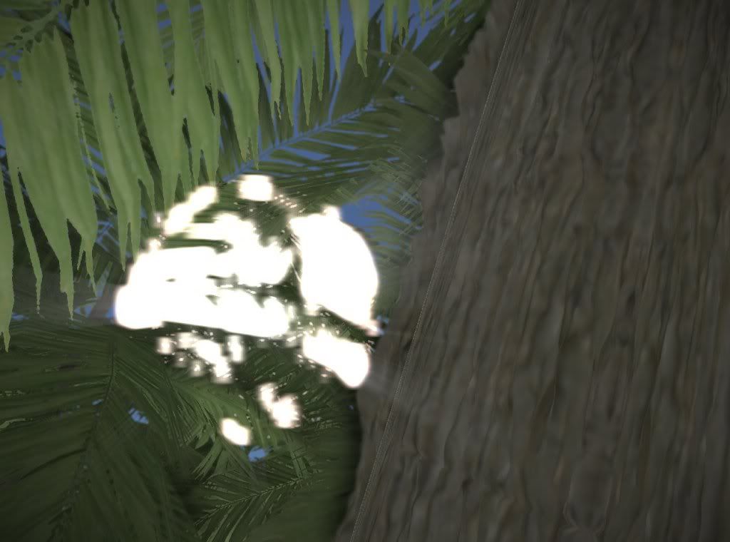
the thing is, I can see AO, a strong lighting from the sun, and has extrusion on the wood surface, but it's strange that with such strong light I can't see any shadow at all it makes no difference between bumpy and non-bumpy surfaces because it looks really flat.
The edge of your tree trunk has blurred out too much it makes it look like fur and not something solid.
This IS constructive feedback.
Screenshot of the Month November [Winner announced!]
My company: https://kloena.com
My profile: https://zhieng.com
My co-working space: https://deskspace.info
My game engine: https://kemena3d.com
My profile: https://zhieng.com
My co-working space: https://deskspace.info
My game engine: https://kemena3d.com
Yes the picture does get blown up when devsh links to it on here, he is correct. So I downloaded it myself, and linked to it to provide the correct size:

First of all everything Virion and BlindSide said is constructive. You need to get a better depth of field shader. I've told you this before. The leaves are blurred far too much, I can see the blurring kernel around where the sun shows through in the center.
Overall, simply put, the image isn't attractive. It's been said before, but I guess it has to be said again, it's technically "attractive" but graphically it's lacking.
TheQuestion = 2B || !2B
the whole thing is not ready yet for video/release, bugs include:
-shadows dissapearing in the first CSM frustum
-swaying tree and shadow sync
-windsources and global wind (shared by trees and water, atm. water has the algo)
-slower fps (i think its the old bug i have been kicking and screaming about)
-shadows dissapearing in the first CSM frustum
-swaying tree and shadow sync
-windsources and global wind (shared by trees and water, atm. water has the algo)
-slower fps (i think its the old bug i have been kicking and screaming about)
I know it's after 15th but I want to share a screenshot of my project.

This is going to be the editor of my adventure game engine I'm tring to create with Irrlicht. It's in very early stage but the interface should stay unchanged. When finished it might be usefull as leved editor for other irrlicht projects.

This is going to be the editor of my adventure game engine I'm tring to create with Irrlicht. It's in very early stage but the interface should stay unchanged. When finished it might be usefull as leved editor for other irrlicht projects.
pretty cool. what you use for your GUI?vins wrote:I know it's after 15th but I want to share a screenshot of my project.
This is going to be the editor of my adventure game engine I'm tring to create with Irrlicht. It's in very early stage but the interface should stay unchanged. When finished it might be usefull as leved editor for other irrlicht projects.
My company: https://kloena.com
My profile: https://zhieng.com
My co-working space: https://deskspace.info
My game engine: https://kemena3d.com
My profile: https://zhieng.com
My co-working space: https://deskspace.info
My game engine: https://kemena3d.com
